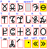
K'tlê has a native writing system consisting of 23 symbols plus space. There are 17 base letters, 1 combining letter, 1 combining diacritic, and 4 punctuation symbols. These are all shown in the image.
Each base letter is labeled with the upper-case version of its transliteration (the lower-case version is normally used).
The combining letter, labeled ʔ, appears above the preceding base letter. After P, T, and K, it acts as a diacritic, turning the plain stops into ejectives; otherwise, it represents a glottal stop.
The combining diacritic, labeled ^, appears at the upper left of the base letter. On a vowel letter, it indicates high tone and on a consonant letter, it indicates gemination. In both cases, it should be alphabetized as if following the base letter in the word.
The most important punctuation symbol is the dot, which precedes every sentence. There are no question marks or exclamation points. The symbol labeled end is placed at the end of the whole text. A direct quotation is placed between a left and a right symbol (there's no special marking for indirect quotations).

The combining diacritic, labeled ^, intersects the letters P, M, K, and A, and is separate otherwise. These are shown in the image along with the only three-character combination.

Here's a sample word.
I started out with a modified roman alphabet (mostly the same letters used in the ASCII transliteration) in a mixture of lower-case letters, small capitals, the pound symbol, a dieresis/umlaut diacritic and a macron. This is messy but possible to implement with CSS. I may still use this scheme for some purpose.
At LCC3, there was an orthography workshop in which one of my partners was Jim Henry; to start, we were to design an alphabet for a phonology they gave us. Someone during a presentation earlier had mentioned the idea of glyphs that could be distorted and/or rotated with being mistaken for each other (IIRC). Jim wanted to try this and started drawing possible letters. I suggested a semi-featural approach using diacritics for the voiced stops and provided the symbol already used in K'tlê . Jim wanted another diacritic for the back vowels, so I came up with the slash in the upper left.
At my motel that night, I realized that the workshop phoneme set wasn't too different from the K'tlê phoneme set, which has glottal consonants instead of uvular stops, ejectives instead of voiced stops, and four vowel qualities plus tone instead of seven vowels. I started playing with this, reassigning some of the glyphs, mutating them, or both. I dropped a couple of the original ones (including one that looks like a balloon animal when I draw it) and invented a couple more. By the time I got back home, I had an alphabet that looks like pretty much what's in the image.
In the present alphabet, the idea of a distinct topology for each glyph has been superceded by other concerns, such as making the alphabet potentially fontable, but it still has a lot of the original "flavor".

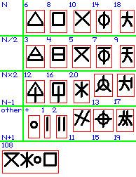
K'tlê also has its own set of numerals. There are symbols for 1 through 20 and a symbol for "plus". The symbols are used as equivalent to the corresponding number-word components, not as digits. As with the alphabet, not much is known about its origins.
page started: 2009.Mar.24 Tue
last modified: 2009.Apr.15 Wed
content and form originated by qiihoskeh
Table of Contents